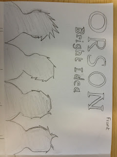
This is the final idea for the digipak, it contains the front pane, back pane and two inlay panes, we have decided to use red and orange in the digipak as the connotation for red is passion it mean that the band have passion for their music, and also red would make the front cover stand out on a shelf over black, bright colours are also used on other album covers made by the band, and that way the target audience will know what to look out for because the style will be the same.
It was planned this way because the target audience then would know just by looking at the front cover that the cd is by Orson and if they already know who the band is then they will know what kind of music they create and they know whether they like it or not.


No comments:
Post a Comment