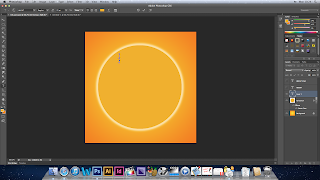
Today i have to put the text and images onto the cd itself, i had to decide on the text i would use and also how big it would be, for this i went by the drawing that the team had drawn of all four panes and as a team we decided on the font which would be 'Trajan Pro' this is the font that we will use throughout the album cover and therefore would promote the theme of consistency and also it would allow fans or the target audience of the band to start to commercialise the font and realise that the font is part of the bands branding. If there was every any merchandise than the font would be used on it etc. This is why the magazine advert for the album will also use this font. When you select the text tab from the list down the left hand side of the Photoshop window, a new layer is automatically created, this makes it easier when editing, you can go straight to the text layer and you can edit the text however you want to.
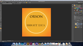
 This is how the Orson writing looks on the cd, i decided on it being this size because it stands out and its big enough but not too big that it upstages everything else on the pane. I think that the target audience will like the font as it is rock like and the serif type font is classic and the fact that its all in capitals makes it stand out even more and makes it look like the most important thing.
I thought that the bright idea text should be identical in the font and that its all in capitals, it is slightly smaller because we are trying to promote the band and by making the bands name slightly bigger will promote the band more. Originally we wanted the writing in the middle of the cd but this could not be done because there has to be space for the cd hole to go, i didn't want to make the text any smaller than it is so i just decided to move it down the cd.

No comments:
Post a Comment