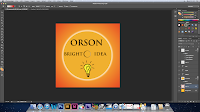
When i showed the rest of my team my pane of the cd cover, they thought that i should introduce more red into the pane, and that a good way to do this would be to use the gradient tool so that i only had to use more red in the corners and use a new layer so that if it didn't look right then i could just change it back or try something different.

 You can see the difference in the cd pane with and without the red being added, I think that the red does look better and that the advice from the rest of my team was valid and that the cd pane does look better with the red added.
No comments:
Post a Comment