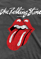
This is the front cover of an album by the Rolling Stones, they were incredibly popular in their day and are still a prestigious band and memorable for their music and the band have created a brand and merchandise based on their fan base, so taking tips and ideas from their work would not be a bad thing.
 I think that we should use the bright colours like the ones used in this album cover, it stands out and promotes the band and also the brand that the band stands for and have created. The brand of the band is based around the tongue used in this cover, most of the bands merchandise is based on this tongue, something that is by the Rolling Stones is normally noticeable due to this tongue.
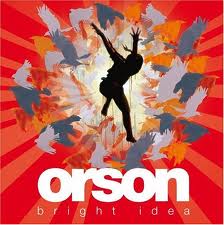
This album cover is bright and colourful but not in such an obvious way as the Rolling Stones front cover, this is because black is used as the background colour instead of a brighter white like the Rolling Stones one, this cleverly subtly brings the colours down in tone and makes them appear duller than they actually are while using the bright colours, this would still stand out on a shelf filled with other genres, but on a shelf full of other rock albums such as the Rolling Stones album cover above i don't think it would stand out very much at all, because of this i think the best way for us to go is to use the kind of bright colours used in the Rolling Stones album cover.
These are two existing album covers that are not by the band that we are making an album and music video based on, i suggested that based on looking at other bands or artists album covers in the rock genre that we should use bright colours and not black and white, this is because that way it can stand out along side all of the other rock albums out there, black and white could look boring and dull and could make people not want to buy it because it looks boring. The front cover of these two album covers do not use any actual images, just graphics, this could be a good route to go down, but we might want to differentiate ourself and stand out further by doing something that bands like these don't do, like use proper images of the band.

This album cover is one by the band that we are going to create an album cover based on, this uses block letters and bright colours, just looking at this is shows that our original idea would not fit in with the bands ideas and previous work, this is one of the reasons that we have to change our ideas to suit the band and what they have previously released as album covers, this is so that the target audience for the band will know what they are looking for when looking for an album by Orson, and just by looking at the front cover they will know what they expect from the music in the album itself.


No comments:
Post a Comment