Thursday, 14 February 2013

igipak - day two

The first thing i did today was figure out exactly what i wanted to do with the background colour, i fiddled around with a lot of different features like image background etc, but i chose to do a gradient coloured background, this is because i liked the way that the colours blended together, and because the cd would be sitting in the middle, you wouldn't be able to see the yellower part of the background as a circle for the cd would be covering it.


Next on the layer 'cd colour' i had to draw out a circle in the middle of the pane, the hardest part was getting it the right size and position so that it was right in the middle of the pane, i did this by making it the same diameter all the way around, this covered the size, but it was increasingly hard to get the circle in the middle of the pane. 

Once i got it in the middle which took a while of moving it a fraction and then moving it back, i had to decide on the colours i would use, i decided to use the same colour as the background colour originally without the gradient feature used, once i got it correct i then had to decide on how i would make the circle stand out on the background, i did this by putting an effect on it called 'outer glow' and this basically does as it says at gives the outer part of the circle a glow. This makes it stand out and will give the cd a nice colour.

Monday, 11 February 2013

Photoshoot for digipak

Today we did a photoshoot for the digipak, we had to take mid shots of all of the band members from the video, we also had to take a photo of the amplifier that will be used for the back cover of the digipak. We had to make sure that the comstumes that the band members would be wearing would be casual as that is the look we are going for on the digipak and in the video, so this needs to match. The background needed to be a neautral white/cream so that we could take the background out of the equation easily on photoshop, if the background was too dark then it would be hard to remove the background and there would be a strange line around each persons head, this would make it look tacky and not professional enough for the digipak and the look we are going for.


The only backgroud that is different is Jacobs image as we didn't have a lot of time left with the camera and we had to get it done quickly. But the part of the wall directly behind his head is still nuetral and will be easy to take the background off of.


We told the boys to dress in casual like they would do any day of the week to college, they did this and they all dressed in a way that we hoped they would, all different, not too colourful and their hair in the typical 'boyband' way, even though the genre we are going for is Rock we wanted the boys to look casual and not too rocky as we are not wanting to make it hardcore rock we want it to be a casual rock look to go with the Rock song.

The image of the amplifier was the hardest to get just right as we couldn't lift it up or have it sitting on anything otherwise you'd see the person's hands that is holding it or the thing it is sitting on. The thing we went for was half wall/half carpet/floor that was colour is added and the neatral colour of the wall is still in it so if we need to add colour then we can. The messy look of the amp goes with the song and overall theme of the video, a messed up look for the amp shows that the boys are lazy and late like suggested in the video, so they do not have time and can't be bothered to clean it.

Digipak - day one

The first thing i did for the album pane that i have been assigned was to decide on the size of the panel, as a team we decided that all of the panels would be 1000 x 1000 pixels, this is because this way it is big enough to have enough detail so it wouldn't get pixelated but it is small enough that it wouldn't take up too much memory. 


This is the pane that appears when you decide the size, this screenshot shows all of the features that photoshop has to offer. All of the colours on the right hand side, all of the different features down the left hand side, this will allow me to do whatever i need to do and hopefully it will allow me to do whatever i want to do without any troubles.


This shows me creating layers for all the different things i will need to do for all of my cd pane, i decided to create all of the layers before i do anything because it means that i won't forget to create new layers throughout the creation process. This will prevent me from ruining a layer by putting something on there that should be on a different layer and not be able to go back far enough to undo it, that would mean i'd have to start again.


The last thing i did today was choose the background colour for the cd pane that i am making, as a team we know what we are doing and we have all decided on the colour that we are using for every pane, this will make it consistent and even though every pane will be made by someone different, it should look like they all fit together as if one person's made them all by the end. Consistency is a big thing in this task because if it is not consistent throughout then it won't look right and could look silly and like they don't fit together. 

Sunday, 10 February 2013

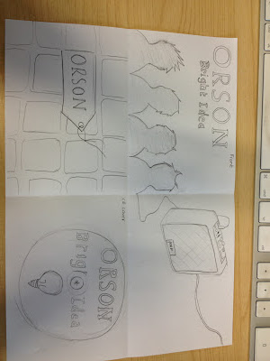
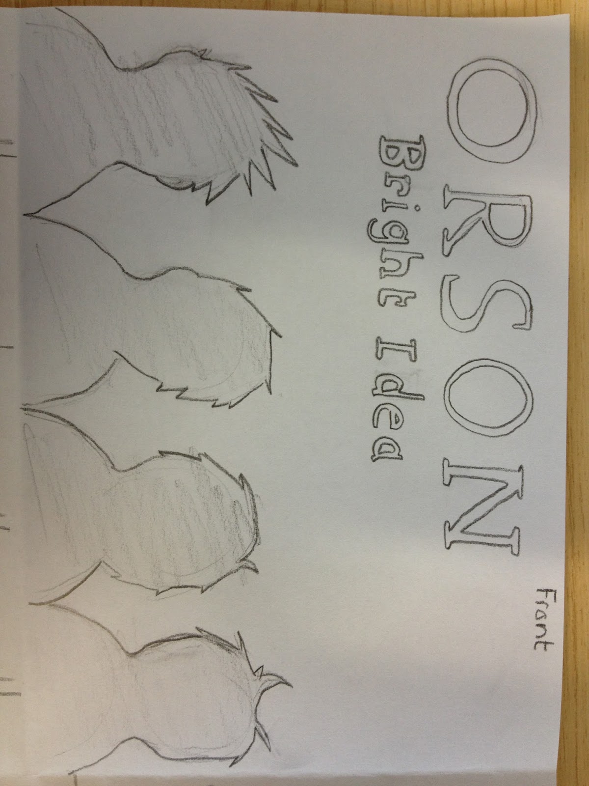
Final idea for digipak

This is the final idea for the digipak, it contains the front pane, back pane and two inlay panes, we have decided to use red and orange in the digipak as the connotation for red is passion it mean that the band have passion for their music, and also red would make the front cover stand out on a shelf over black, bright colours are also used on other album covers made by the band, and that way the target audience will know what to look out for because the style will be the same.
It was planned this way because the target audience then would know just by looking at the front cover that the cd is by Orson and if they already know who the band is then they will know what kind of music they create and they know whether they like it or not.

Friday, 8 February 2013

Digipak- Software?

We have decided to use Photoshop to make the digipak, this is because this software will give us the best looking graphics possible, and this is important to make sure that our digipak fits in with the digipaks already out there representing the rock genre, and good, professional looking graphics are a big part of that. 


Using a program like Microsoft Publisher could have looked ok, but it will not look as professional as something that is created in Photoshop. 
The mac computers that we use in lessons do not have Microsoft publisher on them, so this would mean that if we did decide to use Publisher, we would have to do all of the work outside of lessons and this would also mean that we could not compare and deliberate on ideas and see what looks best. This could mean that all of the panes on the digipak look different or the colours are slightly off, and we wouldn't realise until they were all put together. 


Thursday, 7 February 2013

Digipak- team roles


When deciding who would do what when it came to the digipak we had to go with what was everyones strengths and weaknesses, this meant that Jackie would probably end up doing the front cover anyway as he uses Photoshop on a regular basis so knows the ins and outs of it, and so he would be able to get on with it and know what he is doing straight away and won't have any issues. 

When people like me who have never used Photoshop and has no previous experience using it will have to be taught it completely from scratch, and will have a few issues with doing complicated parts of the creation. 

The final decisions for who will do what for the digipack are: 

Front pane- Jackie Pang
Inlay 1- Kyle Smith
Inlay 2- Me (Jessica Towler) 
Back pane- Danny Wilson 

Danny will be the one to teach me a few things about the basics on how to use Photoshop, but i think that i will be able to figure out a lot of it once i start using it and get the hang of it, i will be able to get used to the way it works and then go from there. 

Monday, 4 February 2013

Digipak- existing products


 This is the front cover of an album by the Rolling Stones, they were incredibly popular in their day and are still a prestigious band and memorable for their music and the band have created a brand and merchandise based on their fan base, so taking tips and ideas from their work would not be a bad thing.
I think that we should use the bright colours like the ones used in this album cover, it stands out and promotes the band and also the brand that the band stands for and have created. The brand of the band is based around the tongue used in this cover, most of the bands merchandise is based on this tongue, something that is by the Rolling Stones is normally noticeable due to this tongue.


This album cover is bright and colourful but not in such an obvious way as the Rolling Stones front cover, this is because black is used as the background colour instead of a brighter white like the Rolling Stones one, this cleverly subtly brings the colours down in tone and makes them appear duller than they actually are while using the bright colours, this would still stand out on a shelf filled with other genres, but on a shelf full of other rock albums such as the Rolling Stones album cover above i don't think it would stand out very much at all, because of this i think the best way for us to go is to use the kind of bright colours used in the Rolling Stones album cover.


These are two existing album covers that are not by the band that we are making an album and music video based on, i suggested that based on looking at other bands or artists album covers in the rock genre that we should use bright colours and not black and white, this is because that way it can stand out along side all of the other rock albums out there, black and white could look boring and dull and could make people not want to buy it because it looks boring. The front cover of these two album covers do not use any actual images, just graphics, this could be a good route to go down, but we might want to differentiate ourself and stand out further by doing something that bands like these don't do, like use proper images of the band.


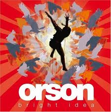
This album cover is one by the band that we are going to create an album cover based on, this uses block letters and bright colours, just looking at this is shows that our original idea would not fit in with the bands ideas and previous work, this is one of the reasons that we have to change our ideas to suit the band and what they have previously released as album covers, this is so that the target audience for the band will know what they are looking for when looking for an album by Orson, and just by looking at the front cover they will know what they expect from the music in the album itself.