 This is the front cover for the digipak, it was made by Jackie and he made each of the silhouettes seperately in photoshop, he had to draw the outlines individually and then fill them in with black infill. The font text is the same throughout, its just switched from black to white, and this makes sense because on the front cover there is black and white, so it alternates nicely throughout the digipak. We have decided not to show the band members faces on the front cover because this way it matches with the video where you don't see one of the faces of the band members, it is kind of a mystery, but we decided to do this so that it matches the video.
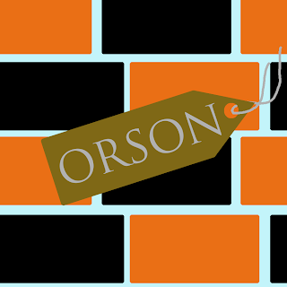
  This is the left inside pane for the digipak, it was made by Kyle and he decided to do this brick kind of design because that way the black and orange could be introduced together in a different way to the front cover, the bands name is also once again used on this pane, this is because we wanted to once again remind people. It is on a tag because at this point Orson could almost be a brand in itself, so by putting it on a tag it means that we are almost branding it.
This is the pane that i made, it is for the cd to sit on, this way i had to design the cd and the pane for it to sit on, i decided to use a similar colour on the cd as the background so when it sits in the case it should blend in with the background, and the lightbulb is there so that there is almost a logo for the band, the colours are consistent throughout the digipak, and this just means that it is consistent, and that we designed it well together and that we all knew what we were meant to be doing.
This is the back pane for the digipak, we decided to use a proper image on the back cover as we hadn't used any throughout the rest, so we used an image of an amp and then edited it and added filters to make it look like the rest of the digipak panes, the song track names are positioned so that it is noticeable but not the first thing that you see, the logo in the bottom corner was also made by Jackie, he made it on Photoshop and the rest of this pane was made by Danny, the small print in the bottom left corner was changed a few times, we deliberated a few times together on what size we all thought it should be, this is the decided size because it is small enough to read but not too big so that it is particularly noticeable. Danny also made the barcode in photoshop, he copied one that he found on google and changed a few of the numbers to make it unique. The orange background that he used is the same as the rest of the digipak and this promotes consistency once again.


No comments:
Post a Comment