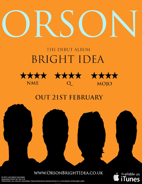
The magazine advert was made in photoshop and we all decided that the main aim was to make it look near enough identical to the rest of the digipak panes, so orange would be the primary colour. Kyle decided to be the person in charge of making it mostly but he would constantly come back to the group and ask whether it was ok and suitable. The colour font that we all decided on was an off white and the rest would be black to contrast against the orange background. The black figures are the ones from the digipak that Jackie made. This is because normally the front cover of an album is duplicated almost for magazine adverts.
The ITunes logo was found off of Google, we decided to add this because it would mean that it was available online and these days digital audio is taken advantage of more than ever and this is using this fact very well as people buy music online more than in cd format.
We decided to put a website url on the magazine advert because then the people that enjoy going online will get the advantages and perks from going onto the online pages and finding out more about the album or band.
The small print is once again located in the same place as the small print on the back cover of the album, this is good product placement as it is something that needs to be there but not many people actually read, this way it is still there but just not very noticeable and doesn't take anything away from the advert itself.
For the different reviews noted on the advert first we had to do research into the kind of people that normally review the type of music that our band it. (Rock) and the first one that came to mind was NME as it is included in alot of magazine adverts, so I went onto the website and looked at the kind of artists on their playlists and it was people like Frank Ocean and The Maccabees, so i knew that after this i could use their name on the magazine advert.

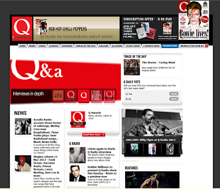
Next i looked at Q magazine's website to see the type of music they promote and again i thought that our band fitted in nicely with their other promotions and decided to use their magazine as a review for our magazine advert.
Lastly i looked at the Mojo website, for the same reasons as above.
Their music promotions weren't exactly the same as our band's music but i thought that it could be a good idea to include them in the reviews as then people that normally get Mojo magazine might be inclined to listen to Orson's music because Mojo were a review on it.


No comments:
Post a Comment