Friday, 8 February 2013

Digipak- Software?

We have decided to use Photoshop to make the digipak, this is because this software will give us the best looking graphics possible, and this is important to make sure that our digipak fits in with the digipaks already out there representing the rock genre, and good, professional looking graphics are a big part of that. 


Using a program like Microsoft Publisher could have looked ok, but it will not look as professional as something that is created in Photoshop. 
The mac computers that we use in lessons do not have Microsoft publisher on them, so this would mean that if we did decide to use Publisher, we would have to do all of the work outside of lessons and this would also mean that we could not compare and deliberate on ideas and see what looks best. This could mean that all of the panes on the digipak look different or the colours are slightly off, and we wouldn't realise until they were all put together. 


Thursday, 7 February 2013

Digipak- team roles


When deciding who would do what when it came to the digipak we had to go with what was everyones strengths and weaknesses, this meant that Jackie would probably end up doing the front cover anyway as he uses Photoshop on a regular basis so knows the ins and outs of it, and so he would be able to get on with it and know what he is doing straight away and won't have any issues. 

When people like me who have never used Photoshop and has no previous experience using it will have to be taught it completely from scratch, and will have a few issues with doing complicated parts of the creation. 

The final decisions for who will do what for the digipack are: 

Front pane- Jackie Pang
Inlay 1- Kyle Smith
Inlay 2- Me (Jessica Towler) 
Back pane- Danny Wilson 

Danny will be the one to teach me a few things about the basics on how to use Photoshop, but i think that i will be able to figure out a lot of it once i start using it and get the hang of it, i will be able to get used to the way it works and then go from there. 

Monday, 4 February 2013

Digipak- existing products


 This is the front cover of an album by the Rolling Stones, they were incredibly popular in their day and are still a prestigious band and memorable for their music and the band have created a brand and merchandise based on their fan base, so taking tips and ideas from their work would not be a bad thing.
I think that we should use the bright colours like the ones used in this album cover, it stands out and promotes the band and also the brand that the band stands for and have created. The brand of the band is based around the tongue used in this cover, most of the bands merchandise is based on this tongue, something that is by the Rolling Stones is normally noticeable due to this tongue.


This album cover is bright and colourful but not in such an obvious way as the Rolling Stones front cover, this is because black is used as the background colour instead of a brighter white like the Rolling Stones one, this cleverly subtly brings the colours down in tone and makes them appear duller than they actually are while using the bright colours, this would still stand out on a shelf filled with other genres, but on a shelf full of other rock albums such as the Rolling Stones album cover above i don't think it would stand out very much at all, because of this i think the best way for us to go is to use the kind of bright colours used in the Rolling Stones album cover.


These are two existing album covers that are not by the band that we are making an album and music video based on, i suggested that based on looking at other bands or artists album covers in the rock genre that we should use bright colours and not black and white, this is because that way it can stand out along side all of the other rock albums out there, black and white could look boring and dull and could make people not want to buy it because it looks boring. The front cover of these two album covers do not use any actual images, just graphics, this could be a good route to go down, but we might want to differentiate ourself and stand out further by doing something that bands like these don't do, like use proper images of the band.


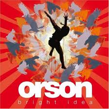
This album cover is one by the band that we are going to create an album cover based on, this uses block letters and bright colours, just looking at this is shows that our original idea would not fit in with the bands ideas and previous work, this is one of the reasons that we have to change our ideas to suit the band and what they have previously released as album covers, this is so that the target audience for the band will know what they are looking for when looking for an album by Orson, and just by looking at the front cover they will know what they expect from the music in the album itself.

Thursday, 31 January 2013

Digipak- newer ideas

When we had to think about the digipak properly we re-thought our ideas about the colours and even layout of the album cover itself, we were going to use a theme of black and white with a four pane front with each member of the band in a separate box and then it would be made humorous by giving them each a different type of moustache, this would give it a playful feel and would show that they are young at heart and want to have fun with their music. 

We have decided to change this idea and have a block colour background, we had different ideas on colours and depending on what colour we use it means a different thing or could give a different message to the audience. Black could mean that it is angry and quite hard metaly type of rock music, light pastel colours would not match the genre of rock at all, because they are too soft and would not match the type of music that is on the album. 

We have decided to use either red of orange, this is because it's bright and will match the type of music on the album, its all quite fast and loud music, and not depressing and slow, if it was slow and depressing love songs then it wouldn't match the genre and the colours used on the digipak would be duller as then it would more likely match the music, and matching the colours used in the digipak to the music in the album is a very important part of creating the digipak, this is because that way the audience will know what they are buying when they see the album cover. 

We have decided on changing the layout and complete idea of the album cover because we didn't believe that our initial idea of the moustaches would come across to the audience in the right way, i believe that the kind of idea that we were thinking to use, of using black and white in the way that we wanted to and the four boxes with each member in one could appear more indie to rock genre. This is because the whole look of it would appear not very rock looking compared to existing rock album covers. 
 

Wednesday, 30 January 2013

Feedback from rough cut

We got feedback from our class and also from the AS group, the feedback is below.
1. Good singing - lip synching
2. Good mise-en-scene
3. Good editing between the performances
4. Good lighting
5. Quick Cuts
6. Good close ups of the main singer
7. Like the close ups of the instruments
8. Variety of frames
 
So overall all of the feedback was good, apparently we have no ways to improve the video itself, so apart from the things we already know that we need to do we don't have to do anything else, this will help us to get on with the digipak once we have finished the video. 


Rough cut of video

This is the rough cut for our music video, it is not yet finished, we have to add some narrative in and speed up some of the shots, but other than that it is almost done, we are going to get feedback from other members of our class on the video and what we could improve.

Monday, 28 January 2013

Editing

Today i started to edit the music video, as me and Danny had already favourited the best clips it meant it was easier to go through the clips and select the ones needed for specific parts of the song.

We started off by uploading the music track into Final Cut Pro, we had to buy the track off of Itunes so the track was in the library and then import it into Final Cut Pro, this means that we have the track in the music video and now we have to put the correct and suitable clips in the right places.

We started by selecting the clips for the first part of the song, the first verse and dragging them into the event, then cutting them down so that we only had the part of the clip that we needed and that fitted with the music.
Once we selected any clips, before cutting them down we had to make sure the audio from the clip wasn't playing over the song itself, to do this we either had to detach the audio from the clip and then deleting the audio or turn the audio down by clicking on line in the clip once dragged into the event and the line has to be dragged down to the bottom of the green tab, this will turn the audio down, it is just temporary so this may be the better option as detaching the audio and deleting it is permanent and to get the audio back i'd have to put the clip in the slot again, from the file into the event. The audio may be needed to match up the lip synching.

First we did the start part of the song which has the beats at the beginning, we chose the clip that has the drums in it and the bass drum is being hit on the beat of the music, this clip fits perfectly to the music, this is good as it will look good, if it didn't match it would look tacky and not very good.