Thursday, 21 March 2013
Wednesday, 20 March 2013
Evaluation Question 1
In what way
does your media product use, develop or challenge forms and conventions of real
media products?
In
the research stages of the project we decided to go with the Rock genre, we did
this because we thought that it would allow us to have the most creativity as
there aren’t a lot of conventions to stick to that would limit what we could or
couldn’t do. This will allow us to include as many ideas as possible of our
own.
So
once we decided on the genre we could then go onto research previous rock music
videos to look for forms and conventions that we would either use or challenge
in our music video.
But first I did research into genre itself to see exactly what I should be looking for and I found out that Andrew Goodwin says that a form of something and the genre of it are totally different and that they have different conventions that should be stuck to and the conventions for forms are different to the genre of something. The form of something is the thing it is, like a music video is a form and there are certain conventions to stick to when you are making a music video and that’s just to make sure it looks like what it is supposed to be. The genre is the type of music video it is, like pop or indie is the type of music video, and then there are specific conventions to stick to that makes sure that your music video is pop/indie.
But first I did research into genre itself to see exactly what I should be looking for and I found out that Andrew Goodwin says that a form of something and the genre of it are totally different and that they have different conventions that should be stuck to and the conventions for forms are different to the genre of something. The form of something is the thing it is, like a music video is a form and there are certain conventions to stick to when you are making a music video and that’s just to make sure it looks like what it is supposed to be. The genre is the type of music video it is, like pop or indie is the type of music video, and then there are specific conventions to stick to that makes sure that your music video is pop/indie.
Conventions for
Music Videos:
So
first I thought it would be best to look into the conventions of music videos
as a form and I found many things and the conventions I took from it were: 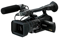 ·
·
·
Camera movement: The movement of the camera
is used to follow the trace the artist or band. Camera movements include tilts,
pans, tracking and crane shots.
·
Mise-en-scene: This refers to the
arrangement of performers and props on stage or in a scene for a production of
a music video or any other media text. Mise-en-scene put importance on the
representation of something.
·
Editing: Jump cuts us the predominant editing
technique used in music videos. This is because this allows a sudden change
from one scene to another. Similarly, transitions such as fade and dissolve are
very common in music videos as they create a different effect to cuts.
·
Lighting: Lighting plays a big part in the production
of music videos as they can create the mood for the whole video, using black
and white lighting can have a depressive/angry mood like the Neyo video ‘Mad’ black
and white lighting was used to create a depressive looking mood and it matched
sad, depressive mood of the song itself. Some music videos are black and white
which help emphasise a particular mood and some videos have artificial lighting
which put the artist(s) in an enhanced look.
·
Sound:
Sound is mainly vocals or the song but in some cases like in Michael Jackson’s
thriller there is a lot of different effects and sounds going on that make the
video look more like a short film than a music video.
·
Props:
These are a vital in aiding to add to the scene and create significance on
particular objects or people
I
found these conventions helpful whilst coming up with ideas as I knew what I
should/shouldn’t involve in the music video, and how to make it look like the
music video I want it to be.
I
then went to look at conventions for rock music videos specifically to see what
would be expected of my music video if it would contend with other rock music
videos.
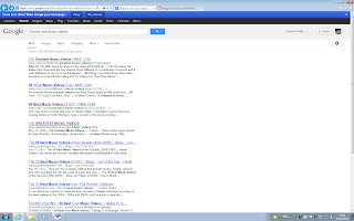
I
went through a few of the links but I couldn’t find any proper lists so instead
I searched ‘rock music video conventions’ to see what came up.
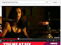
And
then I could watch music videos on YouTube and see whether the conventions fit
the specific music videos.
Conventions for rock music videos:
·
Camera Shots: A wide variety of shots
are used to create an effective pace to match the music. Close ups are normally
used to show emotion or to show how the singing in the track matches the lip
synching.
·
Camera Movements: Camera movement in rock
music is often used to a higher extent than in music videos that tell a story.
Often in band performance videos there are a lot of different camera shots but
they can lack in actual camera movement.
 ·
·
·
Editing: Due to the often fast paced nature of rock music,
editing is mainly done in form of straight cuts in time to the rhythm. Fade
in/outs are also often used at the beginning and ends of more atmospheric
videos.
Conventions we stuck to
There
are many conventions that we chose to stick to whilst creating our music video
and this is because we wanted people to watch it and know that they are
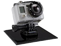
watching a music video and not a trailer to a movie or anything like that.Camera- We used a variety of shots so that we could make it look interesting and so that the audience don’t get bored and turn it off, we decided to use shots like close ups, mid shots, long shots and then some movement shots like panning and tracking, but these ones didn’t turn out the way that we wanted them to while we were filming the performance and when we looked back at them they weren’t good enough to include in the music video, so we chose not to use them. We did however get movement shots from the GoPro camera that we used to film the narrative shots; this gave us movement shots, which meant that we didn’t really need to use the movement shots from the performance filming. It gave us the opportunity to use as many different shots as possible from the performance filming. The amount of different shots we have used will be visually appealing to the audience as it won’t be all the same, and boring, it will make them excited to see what’s coming next.
.jpg)
.png)
Lighting-
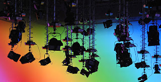 We chose to use the TV
studio lighting(image to the right) for the performance filming to have a more
studio like effect, this is to show that the band are good enough to be
performing in a proper studio, they aren’t just practicing in their garage or
anything like that. We used the lighting but we chose to use the lights without
any colour filters on them because we didn’t want it to look childish and like
a pop video, as the rock genre doesn’t really call for lots of bright colourful
lights. That is the main reason we chose to stick with white lights because we
wanted to stick to the genre conventions as much as possible at this point. The
lighting we used for the narrative scenes was normal everyday lighting, there
wasn’t any special effects of filters added to these scenes, we wanted to keep
it like this because then the audience could see a prominent difference between
the narrative and performance shots, and by the everyday lighting looking
boring compared to the performance TV studio lighting it’s obvious that the
late band member is missing out on something and by the time that he actually
arrives to the studio, all the lighting is out and there is just one spotlight
showing that no one is there, this is boring and shows that he missed out on
the excitement.
 Mise-en-scene-
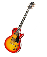 The
props and costumes used were all in line and following the conventions that we
had found out about, we used big drum kits, electric guitars, amps and mics as
props, so that the band would be represented in the best possible way,
otherwise they would look unprofessional and like amateurs, this would not make
them look good to the target
 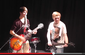 there
is a sense of passion in the music but also a
 hint of danger as there is shouting and gestures that
could suggest anger. The red/orange/yellow on the guitar also matches the digipak; this will show that they are part of one brand identity and that there is a theme to the band.
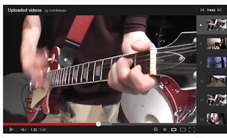 The dark red colour on the edge of the guitar and on the drums matches, this is good because it shows that we had thought about these things prior to the filming and that we wanted everything to match and look like they all belong to the same brand.
 The
costumes that the boys wore were all casual and this gave the video a laid back
feeling and atmosphere, this kind of clothing made it not look too serious and
this is how we thought of the idea to add some comedy into the video, as there
wasn’t too much of a serious feeling so there was room to be able to add some
comedy which isn’t normally seen in rock videos, but we chose to do it because
we thought it would look good and now it’s been added to the video I think that
we were right to add it.
 Tuesday, 19 March 2013
Evaluation Question 2
How effective is the combination of
your main product and ancillary texts?
In the planning stages of production there were a few issues
and questions on how we were going to link the music video to the ancillary
texts, we didn’t know how we would make it clear that they were part of the
same ‘brand’. Once we had made the rough cut of the music video we showed it to
some people in our target audience to get an idea on how good they thought it
was and therefore how effective it was in reaching our aim.
We got some feedback and here is what was said:
· Good singing
· Good lip synching
· Good mise-en-scene
· Good editing between performances
· Good lighting
· Quick
cuts
· Good close ups of lead singer
· Nice close ups of the guitars
· Variety of shots/frames
As we got so many good comments about the rough cut and no
bad comments we knew that we were on the right track to making an effective
music video, we then had to get the video finished and ready to start making
the ancillary tasks (digipak).
Once the final cut had been finished and uploaded onto
YouTube we then went onto thinking about ideas for the digipak, we started by
coming up with a colour scheme, we wanted it to represent the band by being
dangerous and yet show that they are serious about the music, this is how the
band would want to come across. So we went through ideas and blues and greens
seemed to be too masculine, the target audience was all along males and females
so by using masculine colours we would be isolating the females, so we didn’t
want to make it one sided towards one gender to the other, so red and oranges
seemed a good in between, so once we came up with that we had to decide on how
the colours would look on the screen, we instantly realised we didn’t want a
boring block background, so a gradient background seemed like the perfect way
to integrate red with orange and yellow.
I did some research into digipaks and album covers that
already existed(existing products).
This Kings of Leon album cover uses the same colours as I am
using in my album cover, it is not a block colour background because otherwise
it would be too bright and wouldn’t match the distressed look that they were
obviously going for. The name of the album and the band name are the same size
and font, this can mean that they cares just as much about promoting themselves
as the songs themselves.
This album cover for Colbie Caillat is girly yet
sophisticated, it fits the look she is trying to go for. The flowers fit in
with the girly look. She is wearing white which connotes purity and
innocence. The yellow is again a girly
colour and her smile makes her look innocent and excited. Colbie has been
placed in front of a tree and nature to make her look like she is at one with
nature, this would make her likeable.
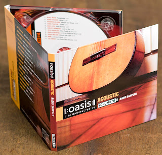
This oasis digipak is made of cardboard instead of plastic, this could be because it is an acoustic album and they wanted to make it look more rustic and original by using cardboard, it suits the wooden look of the cover. The colours used are all natural and neutral, this could show that they are laid back and because the image is of a guitar and not them as a band this could mean that they just care about the music and not so much about promotion of themselves.
This advert is a large print one that has been put up in a
tube station in London. It advertises Madonna’s album and the colours used show
originality and her hair and makeup suggest bravery, as people don’t tend to go
out with that type of hair or makeup unless they want to be noticed and talked
about. The distressed look of the poster suggests that she is old but she’s
putting that out there and showing it off, she doesn’t really care.
This magazine advert for The Killers is set in the woods,
this could suggest that they enjoy nature or that their songs on their album
are natural and the significance of the wooden arm could mean that they are
removing the arm of control that society pushes onto everyone, and the fact
that the arm is wooden could mean that they are trying to get back to their
inner roots. The colours are all natural and neutral, this suggests that they
want to keep everything natural.
There were some ideas that i took from existing products that influenced our ideas when we were thinking about what we were going to do. Examples of this was the colour scheme, we mainly got this from our own ideas and what we thought would look best but there was also influences from other places, like the Oasis album cover and also the Kings of Leon album covers, their colours schemes are mainly orange, this made us feel better about our decision to use orange as we knew it would do well in the market.
There were some ideas that i took from existing products that influenced our ideas when we were thinking about what we were going to do. Examples of this was the colour scheme, we mainly got this from our own ideas and what we thought would look best but there was also influences from other places, like the Oasis album cover and also the Kings of Leon album covers, their colours schemes are mainly orange, this made us feel better about our decision to use orange as we knew it would do well in the market.
This is my
digipak that I created for my advanced portfolio media project.
The front cover for the digipak (top
left) was made by Jackie and he made each of the silhouettes separately in
photoshop, he had to draw the outlines individually and then fill them in with
black infill. The font text is the same throughout, it’s just switched from
black to white, and this makes sense because on the front cover there is black
and white, so it alternates nicely throughout the digipak. We have decided not
to show the band members faces on the front cover because this way it matches
with the video where you don't see one of the faces of the band members, it is
kind of a mystery, but we decided to do this so that it matches the video.
The left inside pane for the digipak (top right) was made by Kyle and he decided to do this brick kind of design because that way the black and orange could be introduced together in a different way to the front cover, the band’s name is also once again used on this pane, this is because we wanted to once again remind people. It is on a tag because at this point Orson could almost be a brand in itself, so by putting it on a tag it means that we are almost branding it.
The pane that I made was the inside right pane(bottom left) , it is for the cd to sit on, this way i had to design the cd and the pane for it to sit on, i decided to use a similar colour on the cd as the background so when it sits in the case it should blend in with the background, and the light bulb is there so that there is almost a logo for the band, the colours are consistent throughout the digipak, and this just means that it is consistent, and that we designed it well together and that we all knew what we were meant to be doing.For the back pane for the digipak(bottom right) we decided to use a proper image on the back cover as we hadn't used any throughout the rest, so we used an image of an amp and then edited it and added filters to make it look like the rest of the digipak panes, the song track names are positioned so that it is noticeable but not the first thing that you see, the logo in the bottom corner was also made by Jackie, he made it on Photoshop and the rest of this pane was made by Danny, the small print in the bottom left corner was changed a few times, we deliberated a few times together on what size we all thought it should be, this is the decided size because it is small enough to read but not too big so that it is particularly noticeable. Danny also made the barcode in Photoshop, he copied one that he found on Google and changed a few of the numbers to make it unique. The orange background that he used is the same as the rest of the digipak and this promotes consistency once again.
The magazine advert was made in photoshop and we all decided that the main aim was to make it look near enough identical to the rest of the digipak panes, so orange would be the primary colour. Kyle decided to be the person in charge of making it mostly but he would constantly come back to the group and ask whether it was ok and suitable. The colour font that we all decided on was an off white and the rest would be black to contrast against the orange background. The black figures are the ones from the digipak that Jackie made. This is because normally the front cover of an album is duplicated almost for magazine adverts.
The ITunes logo was found off of Google, we decided to add this because it would mean that it was available online and these days digital audio is taken advantage of more than ever and this is using this fact very well as people buy music online more than in cd format.
We decided to put a website url on the magazine advert because then the people that enjoy going online will get the advantages and perks from going onto the online pages and finding out more about the album or band.
The small print is once again located in the same place as the small print on the back cover of the album, this is good product placement as it is something that needs to be there but not many people actually read, this way it is still there but just not very noticeable and doesn't take anything away from the advert itself.
For the different reviews noted on the advert first we had to do research into the kind of people that normally review the type of music that our band it. (Rock) and the first one that came to mind was NME as it is included in alot of magazine adverts, so I went onto the website and looked at the kind of artists on their playlists and it was people like Frank Ocean and The Maccabees, so i knew that after this i could use their name on the magazine advert.
Next i looked at Q magazine's website to see the type of music they promote and again i thought that our band fitted in nicely with their other promotions and decided to use their magazine as a review for our magazine advert.
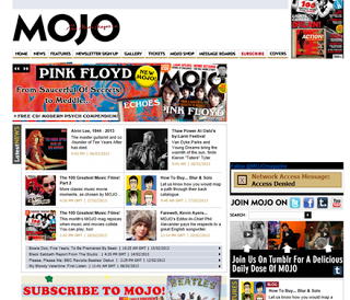
Lastly i looked at the Mojo website, for the same reasons as above.
Their music promotions weren't exactly the same as our band's music but i thought that it could be a good idea to include them in the reviews as then people that normally get Mojo magazine might be inclined to listen to Orson's music because Mojo were a review on it.
Monday, 18 March 2013
Evaluation Question 3
What have you learnt from your
audience feedback?
Once we had thought about all of our ideas and came up with
a final treatment we had to think about target audience and who it would
be. Firstly we looked at Michel
Maffesoli’s target audience theory, this is the ‘urban tribes’ theory.
He said that: “urban tribes are micro groups of people who share common interests in urban areas. The members of these relatively small groups tend to have similar worldviews, dress styles and behavioural patterns. Their social interactions are largely informal and emotionally laden.” His theory in relation to music videos is all down to personal identity and that could cross over with Dennis Mcquial’s uses and gratifications theory, its can all boil down to how you and your personal identity fit into groups.
The ‘groups’ that associate together will tend to listen to the same music and therefore share the same media universe. They watch the same movies and music videos. Certain music genres will generally attract certain ‘urban tribes’.
Such as ‘chavs’ will listen to urban music such as rap and ‘ravers’ would listen to house music which includes drum and bass, dubstep and techno music.
Another useful person that we looked into was Stuart Hall, he said that in media there is such thing as a preferred reading and also oppositional reading. Preferred reading is when someone watches something and they take it in a certain way, when a music video is created the producer has in mind how the audience will see it and if the audience see it in this way it is called a preferred reading. An oppositional reading is when the audience sees it in a whole other way, they take it in the totally wrong way to what they were supposed to, the producer also has to take it in mind so that if this happens then it won’t be seen as bad or wrong but just different. If your video can be seen in different ways it is called polysemic.
Our music videos preferred reading would be that it is obvious that the band member is late and that his day is going from bad to worse, first he is late, then he gets pooped on by a bird, then he helps a criminal to load stolen goods and then he gets chased by a guy dressed in a beer costume, and then he gets to where he should be and there is no-one there. This is the preferred reading, otherwise if anything else was taken from the video then this would be seen as an oppositional reading.
After this research
we decided that we didn’t want to isolate any groups of people but it would be
inevitable whichever way we looked at it. So we thought of the gender and age
range of our target audience and then made a video to see whether our song
choice would fit their personal tastes.
This is our video
for target audience research, with this we found out that our song choice will
fit our target audience well. Our target audience is male and females between
the ages of 17-25, we also found out from our target audience research that
females and males both enjoy Orson- No Tomorrow which is our song choice.
Our draft cut was
shown to people of our target audience age range of male and female genders, we
got some feedback from our target audience on our draft cut and these are the
things that were said:
- Good mise-en-scene
- Good editing between the performances
- Good lighting
- Good close ups of main singer
- Nice variety of frames
Things we could
improve on:
- Could have faster cuts at some points
- Lip synching is abit off in places
We took the
improvement feedback well because we knew that there was something we had to
improve on and therefore work towards ‘perfection’.
We had to add more
cutaways into the timeline so that we could speed up the pace of the video,
this would mean that we could then add the narrative in where it was needed and
add in any other shots where we felt weren’t fast enough or following the pace
of the rest of the video.
Once we had sped it
up we had to move some of the shots around so that we could make sure the lip
synching was how it was supposed to be, however once we exported the video into
Quicktime to put onto YouTube it somehow moved things around so the lip
synching was still out a bit.
Feedback from Final cut:
Feedback from Final cut:
- Lip synching is still a bit out of time
- Good lighting used
- Confusing narrative
- Good mise-en-scene
The lip synching has been explained above but the confusing narrative could come from the Stuart Hall theory above, the people watching it to give feedback could have had an oppositional reading of the video.
Saturday, 16 March 2013
Friday, 15 March 2013
Construction - Digipak complete
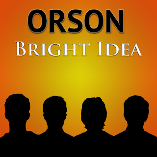 This is the front cover for the digipak, it was made by Jackie and he made each of the silhouettes seperately in photoshop, he had to draw the outlines individually and then fill them in with black infill. The font text is the same throughout, its just switched from black to white, and this makes sense because on the front cover there is black and white, so it alternates nicely throughout the digipak. We have decided not to show the band members faces on the front cover because this way it matches with the video where you don't see one of the faces of the band members, it is kind of a mystery, but we decided to do this so that it matches the video.
 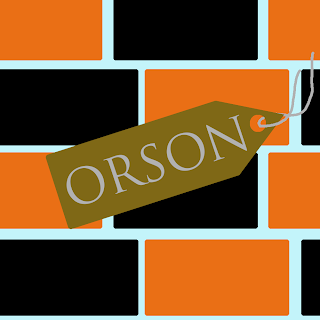 This is the left inside pane for the digipak, it was made by Kyle and he decided to do this brick kind of design because that way the black and orange could be introduced together in a different way to the front cover, the bands name is also once again used on this pane, this is because we wanted to once again remind people. It is on a tag because at this point Orson could almost be a brand in itself, so by putting it on a tag it means that we are almost branding it.
This is the pane that i made, it is for the cd to sit on, this way i had to design the cd and the pane for it to sit on, i decided to use a similar colour on the cd as the background so when it sits in the case it should blend in with the background, and the lightbulb is there so that there is almost a logo for the band, the colours are consistent throughout the digipak, and this just means that it is consistent, and that we designed it well together and that we all knew what we were meant to be doing.
This is the back pane for the digipak, we decided to use a proper image on the back cover as we hadn't used any throughout the rest, so we used an image of an amp and then edited it and added filters to make it look like the rest of the digipak panes, the song track names are positioned so that it is noticeable but not the first thing that you see, the logo in the bottom corner was also made by Jackie, he made it on Photoshop and the rest of this pane was made by Danny, the small print in the bottom left corner was changed a few times, we deliberated a few times together on what size we all thought it should be, this is the decided size because it is small enough to read but not too big so that it is particularly noticeable. Danny also made the barcode in photoshop, he copied one that he found on google and changed a few of the numbers to make it unique. The orange background that he used is the same as the rest of the digipak and this promotes consistency once again.
Wednesday, 13 March 2013
Construction - Magazine advert
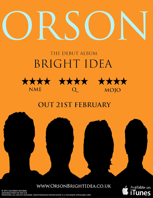
The magazine advert was made in photoshop and we all decided that the main aim was to make it look near enough identical to the rest of the digipak panes, so orange would be the primary colour. Kyle decided to be the person in charge of making it mostly but he would constantly come back to the group and ask whether it was ok and suitable. The colour font that we all decided on was an off white and the rest would be black to contrast against the orange background. The black figures are the ones from the digipak that Jackie made. This is because normally the front cover of an album is duplicated almost for magazine adverts.
The ITunes logo was found off of Google, we decided to add this because it would mean that it was available online and these days digital audio is taken advantage of more than ever and this is using this fact very well as people buy music online more than in cd format.
We decided to put a website url on the magazine advert because then the people that enjoy going online will get the advantages and perks from going onto the online pages and finding out more about the album or band.
The small print is once again located in the same place as the small print on the back cover of the album, this is good product placement as it is something that needs to be there but not many people actually read, this way it is still there but just not very noticeable and doesn't take anything away from the advert itself.
For the different reviews noted on the advert first we had to do research into the kind of people that normally review the type of music that our band it. (Rock) and the first one that came to mind was NME as it is included in alot of magazine adverts, so I went onto the website and looked at the kind of artists on their playlists and it was people like Frank Ocean and The Maccabees, so i knew that after this i could use their name on the magazine advert.
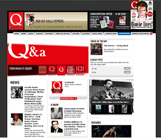
Next i looked at Q magazine's website to see the type of music they promote and again i thought that our band fitted in nicely with their other promotions and decided to use their magazine as a review for our magazine advert.
Lastly i looked at the Mojo website, for the same reasons as above.
Their music promotions weren't exactly the same as our band's music but i thought that it could be a good idea to include them in the reviews as then people that normally get Mojo magazine might be inclined to listen to Orson's music because Mojo were a review on it.
Sunday, 10 March 2013
Permission to use music email
This is the email that I sent to the copyright holder for the song 'no tomorrow by Orson' i asked them to use their music in my music video because i don't want to use their song without permission, otherwise i could get sued for using music without permission.
Saturday, 9 March 2013
Cameras and technology
We used a range of technology within all aspects of the project:
Research
In the research stages of the project we used a Mac computer to research the genre we were going to make a music video based on, existing artists/bands and anything else we needed to know about the project and what we had to do.
Planning
 In the planning of the music video we used simple programs like Microsoft Word to produce shot lists and shooting schedules, we then used a printer within the media classroom to print these off, we kept these in a file that we could take with us on filming days, this will make the filming easier and more efficient as we will know what we need to film at certain times.
 We then used Final Cut Pro to produce the animatic of our music video, this is when you draw out every scene of the video and then put it into Final Cut and then add the music over the top of the drawings so you can see how the video should look once you have filmed it and how the music goes with it. This was very helpful as we could see what part of the filming would be matching the music this made it easier when it came to editing.
Construction
In the construction stages we used different cameras to film the shots for the video.
.jpg)
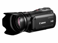
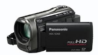 For the performance shots we used a large Canon HD video camera, we used this to get the HD shots we needed, with the lighting we used it looked very professional and this is what we were aiming for, we also used a smaller camera to shoot the tracking shots and less specific shots, as we used the larger camera for all of the close up shots.
We used a GoPro to shoot the narrative scenes as it can sit on your head using a head strap, this give a fish eye kind of look to the shots and this is what we were aiming for. This type of camera is normally used on all terain vehicles for filming, this is how we knew we would be able to get the effects we wanted using it.
Research
In the research stages of the project we used a Mac computer to research the genre we were going to make a music video based on, existing artists/bands and anything else we needed to know about the project and what we had to do.
Planning
 In the planning of the music video we used simple programs like Microsoft Word to produce shot lists and shooting schedules, we then used a printer within the media classroom to print these off, we kept these in a file that we could take with us on filming days, this will make the filming easier and more efficient as we will know what we need to film at certain times.
  We then used Final Cut Pro to produce the animatic of our music video, this is when you draw out every scene of the video and then put it into Final Cut and then add the music over the top of the drawings so you can see how the video should look once you have filmed it and how the music goes with it. This was very helpful as we could see what part of the filming would be matching the music this made it easier when it came to editing.
 Construction
In the construction stages we used different cameras to film the shots for the video.
.jpg)
 For the performance shots we used a large Canon HD video camera, we used this to get the HD shots we needed, with the lighting we used it looked very professional and this is what we were aiming for, we also used a smaller camera to shoot the tracking shots and less specific shots, as we used the larger camera for all of the close up shots.
 We used a GoPro to shoot the narrative scenes as it can sit on your head using a head strap, this give a fish eye kind of look to the shots and this is what we were aiming for. This type of camera is normally used on all terain vehicles for filming, this is how we knew we would be able to get the effects we wanted using it.
Subscribe to:
Comments (Atom)


